

When it comes to data hygiene, a data management dashboard is one way of keeping on top of your CRM housekeeping.
Set up correctly, it provides the people who look after your data management with immediate insights into how your HubSpot portal itself is performing — and where it could use a tidy.
So how should you set one up and what should you include?
In this demo to data hygiene dashboards, we run through which reports are a must-have and how they’ll help you to keep your data clean — with screenshots taken from an example dashboard in our test portal.
Let's go:

Example data management dashboard
We’re often asked about setting up data hygiene dashboards correctly, but for obvious reasons, we can’t show examples of live dashboards from our clients’ portals.
To get around this, we’ve created an example dashboard in the BabelQuest test portal, Babeltest.
This is the place where we conduct lots of our tests, experiments, and other feats of HubSpot magic before we run with them in real-life environments and live scenarios.
The numbers might not be real, but for the purposes of this guide, it means we can show you what a typical data hygiene dashboard looks like — including all the key reports we include, namely:
- unsubscribes
- bounces
- no contact owner
- no subscription type
- contact created compared to last year
- contact created totals by source
- "Missing data" reports
- contacts by country
- no associated company
- missing job title/no associated company by source
As a baseline, we believe these reports (and the data therein) provide a strong indicator of a HubSpot portal’s health and where there are gaps in, or questions around, data hygiene.
Let’s look at each report in more detail and how we set them up.
Reports to include...
Unsubscribes
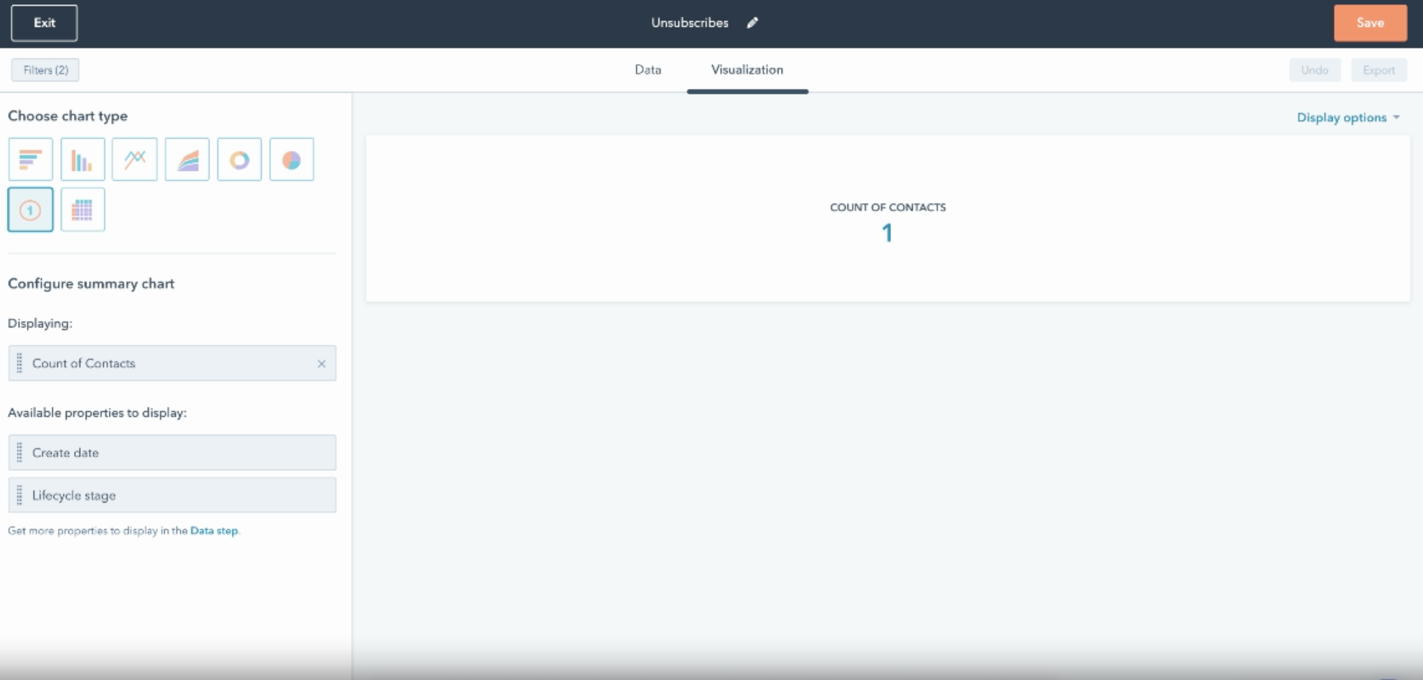
Having an overview of the number of unsubscribes in your database is helpful for a number of reasons. It will help you to spot trends in unsubscribes, for example contacts who you know belong to a specific segment or who were targeted by recent content. It also helps you to see which contacts in your database have become unengaged (an unengaged contact being less valuable than those you can market to and communicate with more freely).
When adding this report to your data hygiene dashboard, I find the "all-time" default most helpful, so old data isn’t lost or excluded. Simply click into the report to select which time frame you’re looking at.
Then add a filter, in this case "Unsubscribed from all email" is equal to True.
If you want the breakdown to have more information, for example "Original source" or "Owner," then drag those filters into the list. When you click into the report, all those options will appear, giving you that easy drill-down you need from your data hygiene dashboard.
Bounces
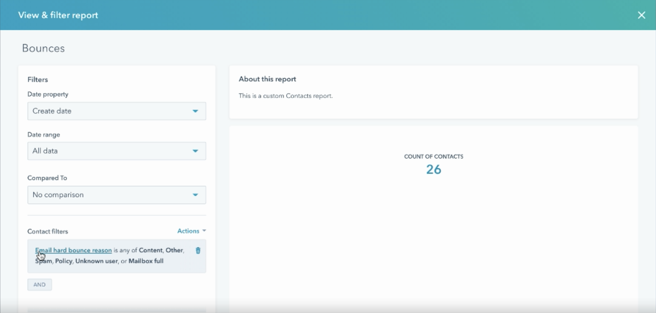
Once you’ve built the first module, it’s really easy to build out more. Clone the first as many times as you need and change the filter to a different metric or data point accordingly. For our "Bounces" module, you can see we changed the filter to "Email hard bounce reason" is any of Content, Other Spam, Policy, Unknown user or Mailbox full for an accurate snapshot of how many contacts are bouncing. (Some people take out "Mailbox full" if they don’t consider this a true bounce — that’s down to you.)
No contact owner
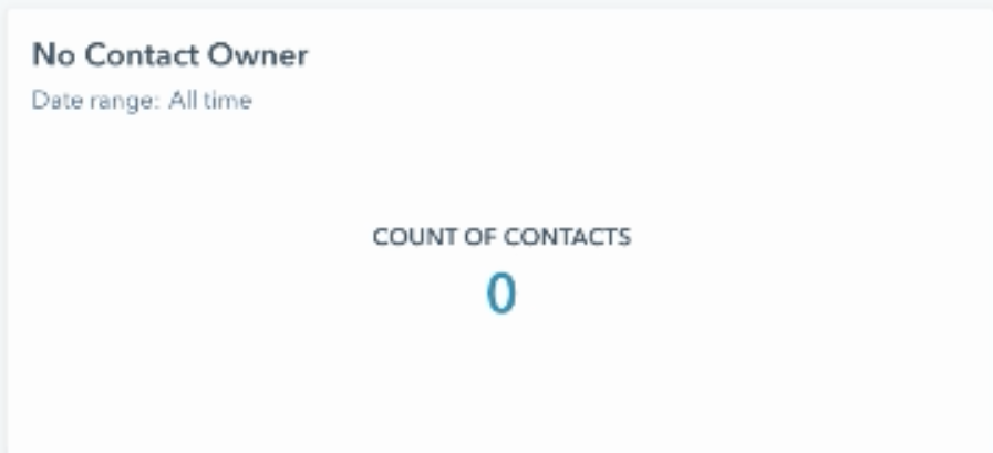
Repeat the process for "No contact owner". This report is useful for making sure every contact in the database has an owner, which is a particularly valuable datapoint if you have a partitioned system, for example.
No subscription type
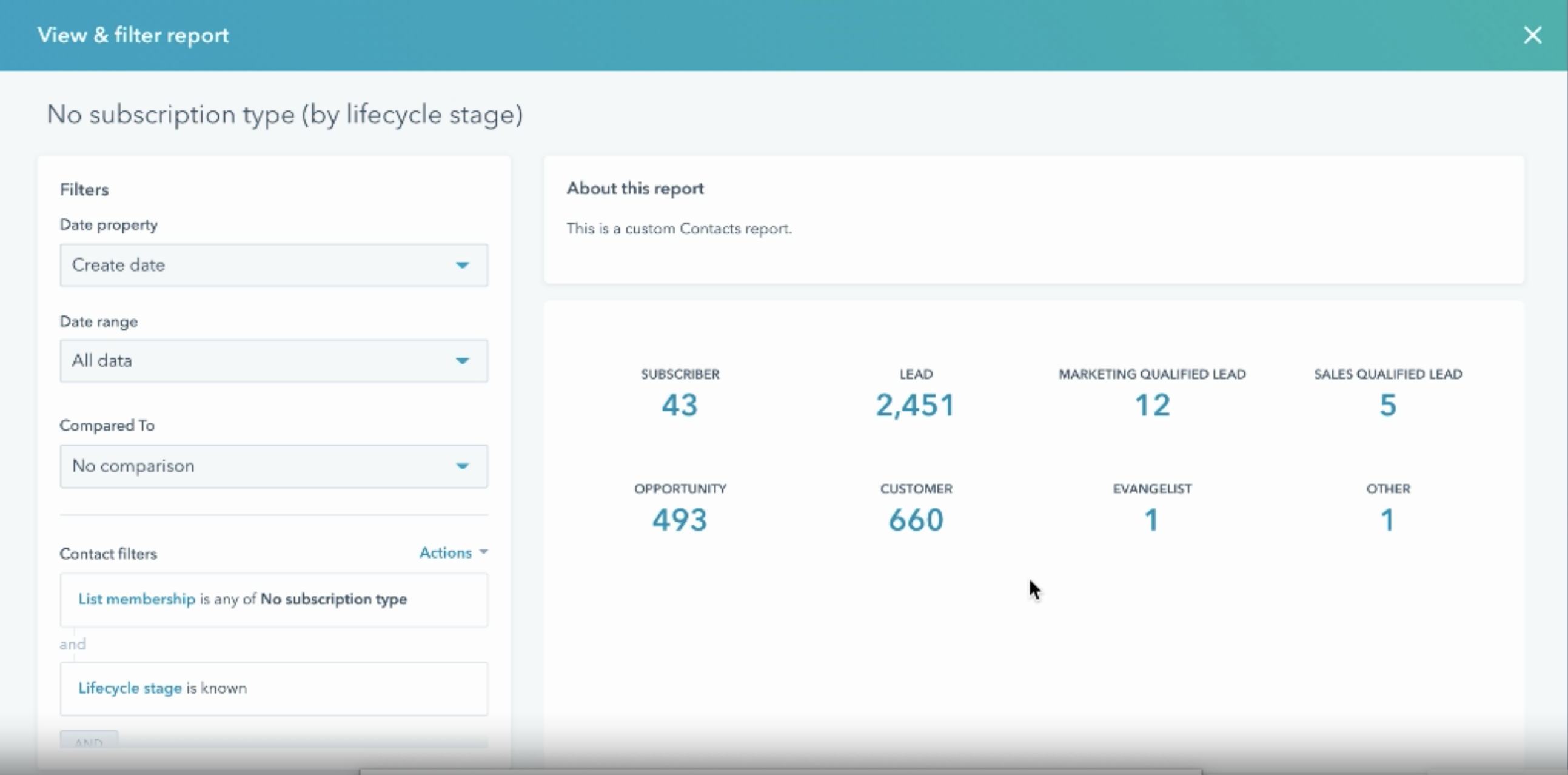
This report is especially valuable if you have the GDPR tools turned on in your portal, but there’s no way to add a quick filter for "No subscription type".
While it involves a little more work to set up than the previous three reports, it’s worth it as it can be really helpful to know who isn’t opted in and where those leads are coming from. in an ideal world, if you have marketing contacts — and you could add a filter to only show marketing contacts here — and you’re paying for those contacts, you want to make sure you can actually market to them. If they have no subscription type, however, you can’t.
(Note that if you don’t have permission to market to them, that’s a whole other issue — do you need to look into your opt-in procedures? Are integrations creating new contacts without adding this?)
Be sure to filter the report so no "Unsubscribes" are being counted. That way, this report is only showing you those contacts in no man’s land — contacts who are subscribed but who haven’t opted into anything specifically. Because you can’t filter directly on "no subscription type", the best way to do this is to create a smart list separate to this that pulls in "contacts who aren’t unsubscribed" and "contacts who aren’t opted into this subscription type", which gives you accurate data in the form of a list of relevant contacts.
Contacts created compared to last year
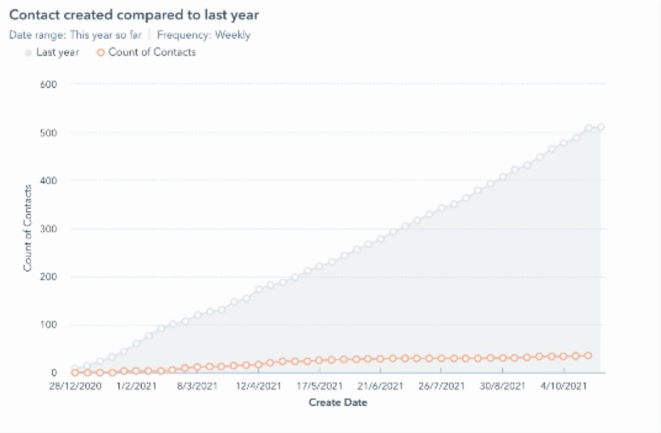
Whether you’ve got contact tiers in the portal (and so have marketing contacts) or you’re on the old system, keeping on top of the total number of contacts in the system is really important. This graph shows the number of contacts created cumulatively so far this year compared to last year.
Using this report, you can accurately predict when you’ll hit your contact tier and put in place measures such as clean-ups to reduce the number of contacts in the system.
Contact created totals by source
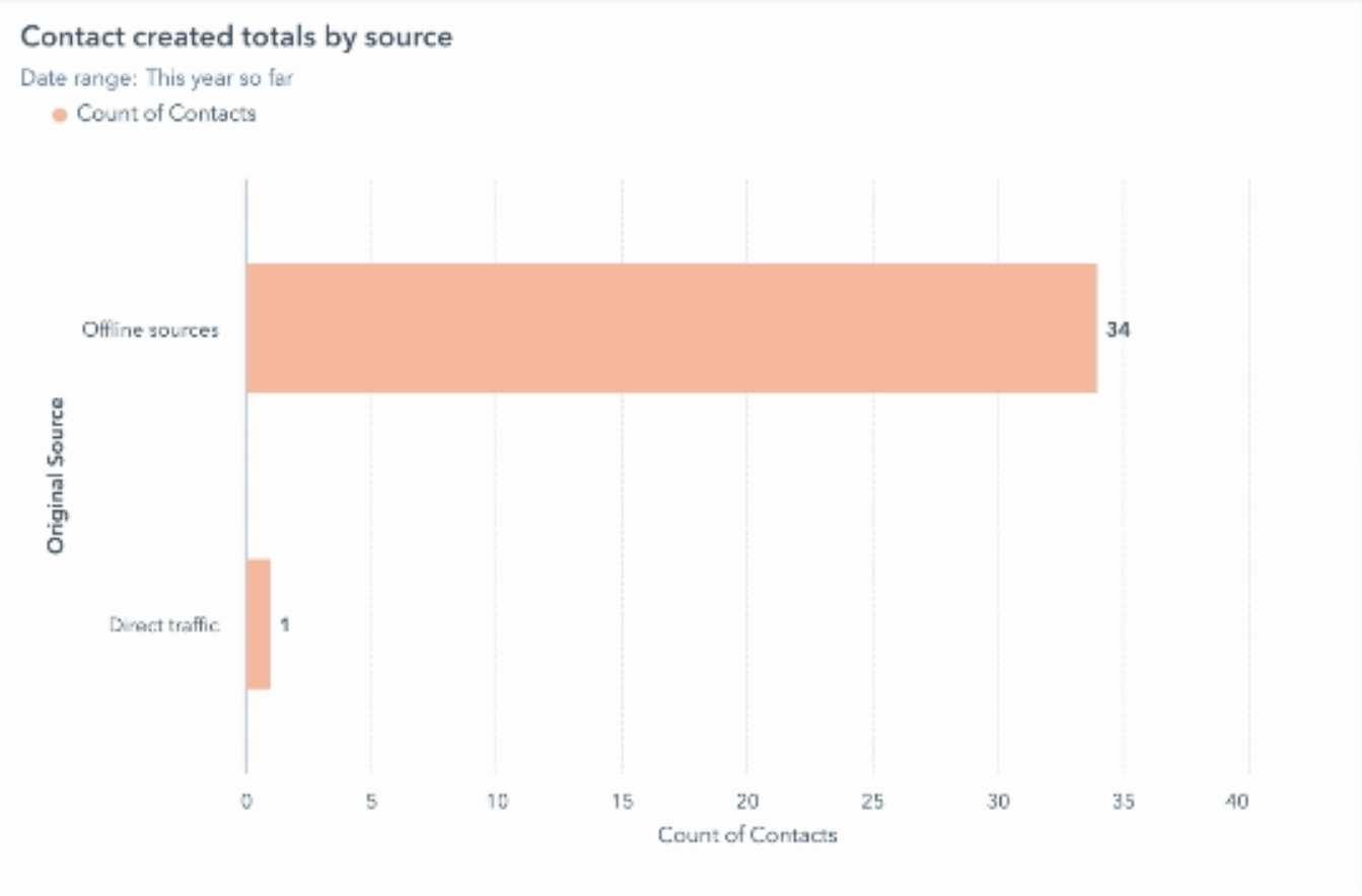
When positioned beside the "Contact created compared to last year" report, this report makes it easy to see, at a glance, where new contacts have been created from.
- Is an integration creating them? Salesforce integrations are a good example of this.
- Where appropriate, could you limit which contacts are going into the database?
- Are people importing large volumes of leads?
"Missing data" reports
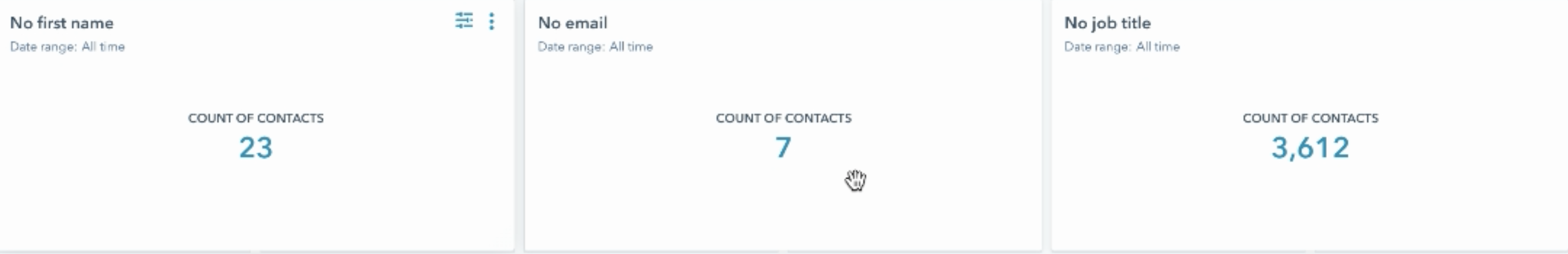
Other reports that can be easily set up by cloning those above and changing the filters to highlight missing data in the CRM include:
- No first name — who doesn’t have a first name? Contacts without a firm name hinder the success of personalisation tactics or broader contextual marketing strategies.
- No email — this is a waste of a contact in the system as these contacts can’t be contacted.
- No job titles — many marketing strategies rely on job title information in order to ensure content and distribution activities are targeted and relevant, for example.
This information can be easily displayed as summaries but you can easily display them in more detail by clicking into the report and selecting a different graph type to get more information. (For example, is it a specific team or region that doesn’t have job titles?)
These kinds of reports are really helpful for keeping your data clean and your database healthy.
Contacts by country
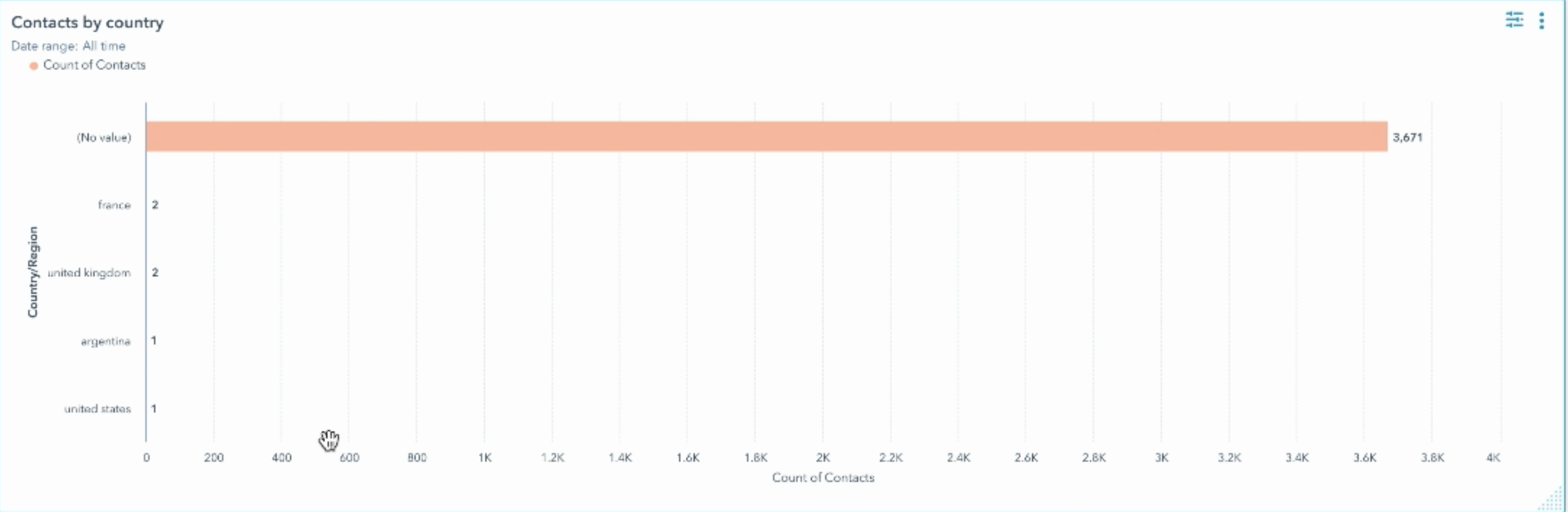
Next, show the number of contacts created by country. Are there specific countries creating more contacts? Are there any contacts that don't have a country? If ‘country’ is a really important metric for you, this will highlight where to go in and ‘clean up’ your records.
No associated company
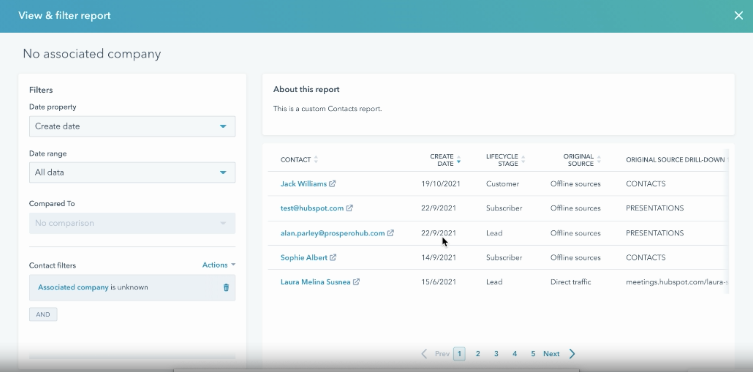
At the very least, all your customers should have associated companies. This report makes it easy to drill into your database and reveal customer records that don’t have companies associated with them.
Having clicked into the report, filter by "associated company is unknown" and pull in any relevant fields, for example "original source" and "lifecycle stage" in the drill downs.
- Which customers don’t have a company?
- Where did they come from?
- Why don’t they have an associated company?
You can then click "go to contacts" and the report will apply the same filters in a contact view. This data can be easily exported, which is really handy from a practical perspective, especially if you’re working with large volumes of data.
Missing job title/No associated company by source
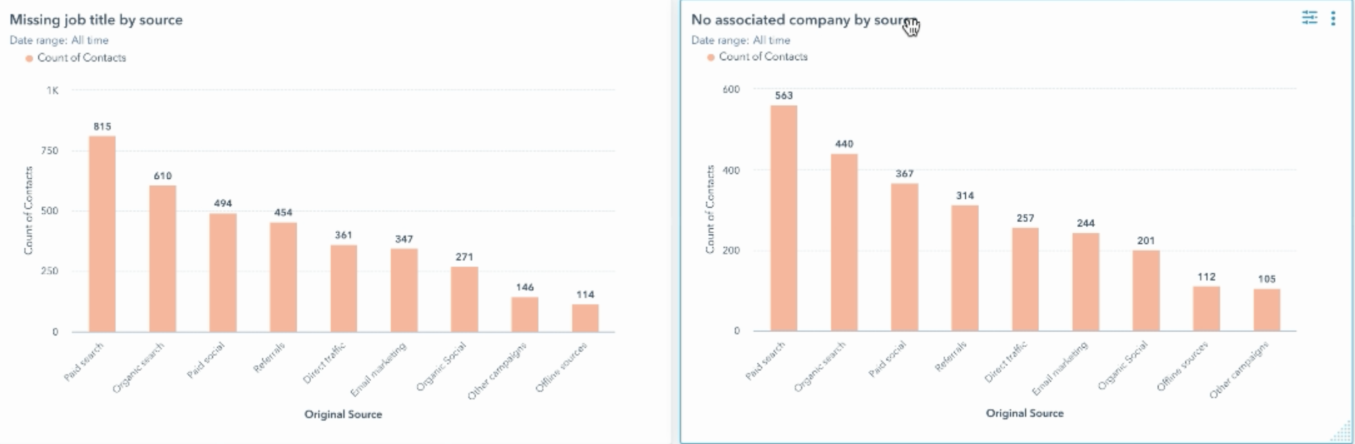
Say job title was one of the core fields you needed filling out for lead scoring and progressive profiling, being able to display "missing job title by source" can help you to identify where you need to add "job title" as a field to the form to capture this vital information.
These sorts of reports are perfectly displayed as bar graphs with the relevant filters.
What’s missing from your data hygiene dashboard?
These are my go-to reports for an effective data hygiene dashboard but that doesn’t mean they’re the only data points you should include. What fields are really important to your business?
If you wanted to make sure that every deal has an associated contact so you can correctly attribute revenue, you could have a cross-object report that looks at that, for example.
Or say you notice that one source was missing lots of data, is there a workflow that’s not firing properly or has a form accidentally been created that doesn’t contain certain fields?
There are so many other complex reports that you could run but at a basic level, those listed here will give you an overview of the portal, its health, and quick wins when cleaning it up.
Got a question about data hygiene dashboards or broader data management?


.png?width=50)

.png?width=50)
.png?width=50)


