The human eye is drawn to areas of interest, whether this is a flashy sign outside a shop or that attractive so-and-so smiling back at you across the office.
From an evolutionary perspective, being able to quickly scan and focus on important details can literally be the difference between life or death.
Nowadays, this ability tends to have greater applications for the supermarket aisle than it does life or death situations, but this isn't to say the savvy marketer can't still make use of it to improve the performance of their inbound marketing strategies.
Specifically, as we’re conditioned to search out objects of interest, marketers can ensure their forms are designed to be picked up by someone scanning a web page.


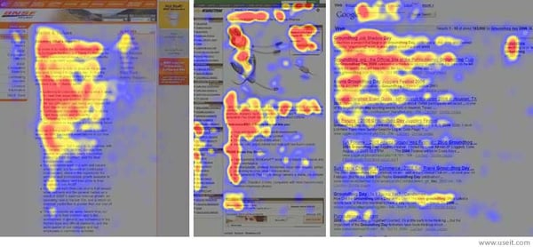
Image source: https://www.nngroup.com/articles/f-shaped-pattern-reading-web-content/
Making a case for form placement
The majority of us read left to right, so we’d expect our visitors to read the information on the left-hand side of the page, before then going on to (hopefully!) complete the form on the right.
But there has been some evidence to suggest that forms located on the left-hand side of the page might, actually improve conversion rates.
Back in 2006, Jakob Nielson of the Nielson Norman Group, conducted a study to determine how people read web pages. He tested 232 participants by tracking their eye movements and found that their reading behaviour was pretty consistent across the board.
Nielson discovered that people typically read in one dominant pattern. This pattern looks slightly like an ‘F’ and is made up of the following elements:
- People viewing websites often first read across the top part of the content area, in a horizontal movement. This forms the top of the ‘F’
- They then scan down the page slightly before reading across in a second horizontal movement. This movement is usually much shorter in duration and forms the the middle of the ‘F’ shape
- Finally, most people typically scan the content's left side in a vertical movement. This can either be quite fast, or much slower and more deliberate, forming the base of the ‘F’. Slower reading tends to show up as a solid line on an eye-tracking heatmap, whereas faster scanning creates a ‘spottier’ pattern
So how does this translate to landing pages?
Looking at the heat map above, you can see that, even though a lot of the activity is concentrated on the left-hand side of the page, there are smaller but dense heat areas on the right.
The most important part of your landing page is the form. You want people to fill this in, but a lot of the time they won’t, and this may be because the majority of the copy is on the left. If someone quickly scans down that side of the page and doesn’t engage, they’re much more likely to bounce from page without completing the form.
But if we move the form to the left-hand side, we should expect people to find the important stuff on the right — without wasting time reading the whole thing — then scroll down to the call-to-action at the bottom.
Let’s put this into practice
Always inquisitive, we put left vs. right form placement to the test, setting up an A/B test on our highest-converting landing pages — and the results were surprising.
These test pages were identical in everything except for the placement of the form. We ran the tests for between 20-30 days to get enough data to compare and draw conclusions.
And collectively, forms on the left-hand side had a 22.11% click-through rate, compared to forms on the right, with a lower CTR of 15.38%.
If you’d like to try this out in your own business, simply create two versions of your landing page. Run each of them for at least three weeks independently to see which one converts more.
How to increase form conversions for your business
If you’re using HubSpot to A/B test landing pages, you're off to a good start. You can set up your test, still using your two different versions and run them simultaneously. The platform will make sure that your website visitors will see the different variations without having to create a new landing page with a different URL.
Of course, this won’t work for every business, and in some cases, forms on the right-hand side will convert better than those on the left. It’s all about finding out which is the most effective for your business and your potential customers.
We’ll continue to run our test to collect more data, but, in the meantime, if you plan to run a similar test, let us know what results you get in the comments.
Learn more about conversion rate optimisation and discover the role it plays in your wider inbound strategy by downloading our free ebook below.


.png?width=50)

.png?width=50)
.png?width=50)


